SaaS website design is evolving faster than ever, shaping how businesses acquire and retain users in 2025. In such a competitive landscape, a standout saas site must deliver clear messaging, captivating visuals, seamless user experiences, and strong credibility signals. This article highlights 12 inspiring SaaS site examples that set new benchmarks for creativity, usability, and conversion-driven strategy. You will discover a diverse range of innovative designs, learn what makes each unique, and gain actionable ideas for your own projects. Ready to elevate your saas site? Dive in and get inspired by the best in the industry.
What Makes an Inspiring SaaS Site Design in 2025?
The bar for a standout saas site is higher than ever in 2025. Successful sites are not just visually appealing, they are strategically built for seamless user experiences, persuasive messaging, and strong conversion. As user expectations evolve, only those who innovate across design, storytelling, and credibility will truly stand out.
The Shift Toward User-Centric Design
A modern saas site must prioritize users at every step. Intuitive navigation, accessible layouts, and mobile responsiveness are now the baseline. According to recent studies, 88 percent of users are less likely to return after a poor experience, making usability a non-negotiable factor.
Brands like Webflow lead by offering interactive demos, letting visitors explore features without friction. Notarize guides users through onboarding with clear, step-by-step flows. These examples show how a user-centric saas site not only drives engagement but also boosts conversion rates.
- Intuitive menus and clear navigation
- Responsive design for all devices
- Streamlined onboarding and demos
By making the user journey effortless, a saas site can convert visitors into loyal customers.
Visual Storytelling and Brand Differentiation
Visual storytelling is the heartbeat of every inspiring saas site. Custom illustrations, subtle animations, and a unique color palette instantly communicate brand personality and product value. In a crowded market, these creative elements help a saas site stand apart.
Framer uses dynamic visuals and motion to showcase its creative potential, while Partful’s vibrant palette and animated product displays reinforce its innovative brand. Story-driven visuals do more than decorate—they guide users to understand features at a glance.
- Branded color schemes and illustrations
- Animated product highlights
- Visual cues for user flows
When a saas site leverages visuals effectively, it leaves a memorable impression and builds emotional connection.
Clarity in Messaging and Value Proposition
Clarity is the backbone of high-performing saas site messaging. Visitors need to grasp your value proposition in seconds. Concise, benefit-focused headlines and subheadings are essential, while ambiguous hero copy leaves users confused and disengaged.
Sites like Modash and KeyNest excel with direct, actionable headlines supported by visual cues. Avoiding jargon and ensuring every call-to-action is crystal clear helps drive users toward sign-up or demo requests. For those refining their messaging, messaging that creates intent offers actionable strategies specific to saas site clarity.
- Clear, benefit-oriented headings
- Specific, visible calls-to-action
- Supporting visuals for quick understanding
A clear saas site message removes friction and boosts confidence in taking the next step.
Building Trust: Social Proof and Credibility
Trust is a pillar of every effective saas site. Strategic placement of testimonials, recognizable client logos, and detailed case studies builds instant credibility. Data shows that adding social proof can increase conversions by up to 34 percent on key pages.
Proof’s homepage features real user testimonials and results screenshots, while KeyNest highlights its partnership with Airbnb as a trust signal. This approach reassures visitors that the saas site delivers on its promises.
- Prominent testimonials and client logos
- Case studies with measurable results
- Third-party endorsements and partnerships
By weaving credibility throughout the saas site, brands can overcome skepticism and encourage action.
Conversion-Focused Structure and Experimentation
An inspiring saas site is never static. Leading brands use A/B testing, sticky calls-to-action, and personalized landing pages to optimize every stage of the user journey. Each page—from features to pricing—caters to specific needs, ensuring visitors always find relevant information.
Shopify and PandaDoc are known for their conversion-driven design, regularly refining layouts and CTAs based on user data. Experimentation is key, as even small tweaks can significantly boost sign-ups or demo requests.
- A/B testing for headlines and layouts
- Sticky CTAs and dynamic landing pages
- Pages tailored to each user segment
Continuous improvement ensures a saas site remains effective and competitive in a fast-changing market.
12 Inspiring SaaS Site Designs to Watch in 2025
The landscape for SaaS site design is more competitive than ever. As we move into 2025, the bar for creativity, usability, and conversion is rising rapidly. Below, we highlight 12 SaaS site examples that exemplify the best in modern design, user experience, and conversion strategy. Each selection offers actionable inspiration for founders, marketers, and designers seeking to elevate their own SaaS site.
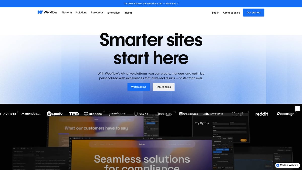
Webflow
Webflow’s SaaS site is a masterclass in visual storytelling and interactive UI. The homepage features advanced animations and an intuitive layout, allowing users to experience the product’s power firsthand.
Pricing: Free plan available, paid plans from $14/month
Core Features: No-code website builder, CMS, e-commerce, advanced animations
Key Benefits: Visually stunning, animation-rich design that demonstrates the platform’s capabilities
Target Audience: Designers, marketers, businesses wanting custom sites
Pros: Interactive demos, clean structure, modern aesthetics
Cons: Learning curve for beginners
Unique Selling Point: The SaaS site itself acts as a live portfolio, showing what users can build.
The Webflow SaaS site sets a high standard by integrating interactive content and seamless navigation, ensuring visitors immediately grasp its value.
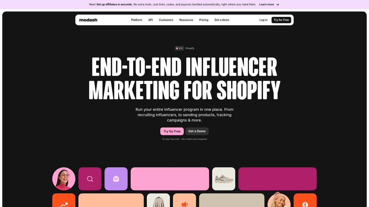
Modash
Modash’s SaaS site excels with clear messaging and a focus on building trust. The minimal design is paired with concise copy, dashboard previews, and case studies highlighting customer success.
Pricing: Free trial, plans from $120/month
Core Features: Influencer discovery, analytics, monitoring
Key Benefits: Clear copy, dashboard previews, social proof elements
Target Audience: Marketing teams, agencies, brands
Pros: Straightforward navigation, minimal distractions, strong SEO
Cons: Pricing may be high for small businesses
Unique Selling Point: The SaaS site prioritizes trust-building and transparent value communication.
Modash’s approach shows how a SaaS site can drive conversions with simplicity and credibility.
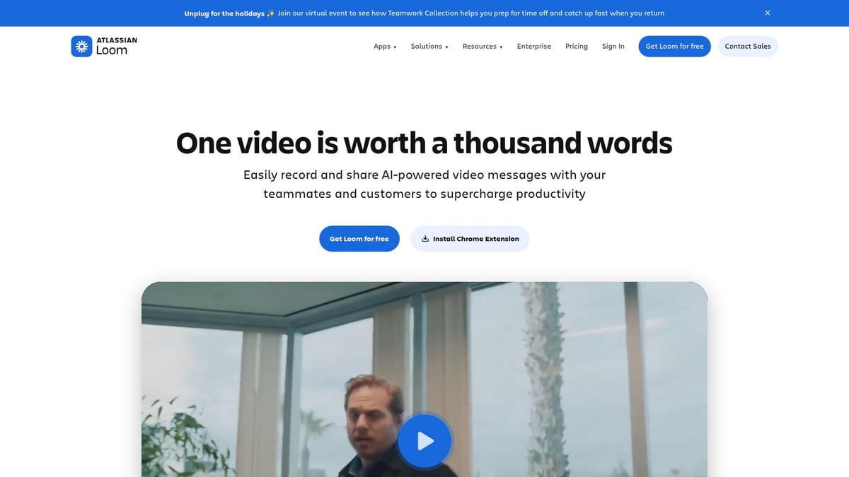
Loom
Loom’s SaaS site leverages bold typography and use case-driven navigation to immediately communicate value. The design uses animation subtly, blending product demonstrations into the user journey.
Pricing: Free plan, paid plans from $12.50/user/month
Core Features: Video messaging, screen recording, integrations
Key Benefits: Strong headline copy, tailored use case pages, vertical-aligned social proof
Target Audience: Teams, educators, remote workers
Pros: Seamless UX, intuitive navigation, clear benefits
Cons: Limited editing in free plan
Unique Selling Point: Animation is woven into the SaaS site experience, making the product’s value clear.
Loom’s SaaS site is a great example of user-centric design that keeps visitors engaged and informed.
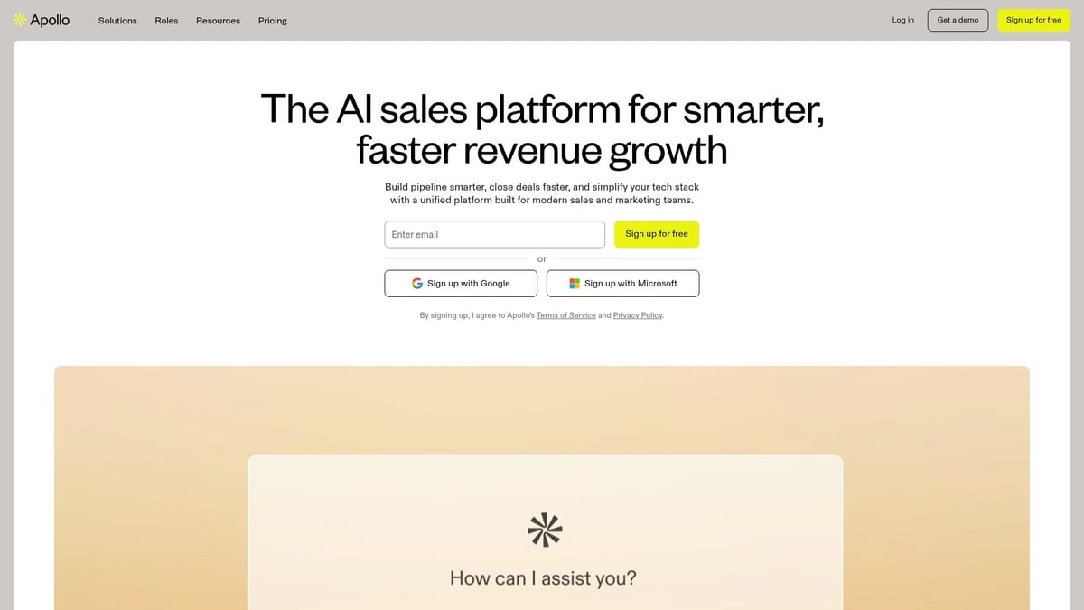
Apollo.io
Apollo.io’s SaaS site features a clean, professional aesthetic with a focus on interactive demos and structured navigation. The mega menu and sticky pricing bar help users explore features with ease.
Pricing: Free plan, paid plans from $49/user/month
Core Features: Lead generation, sales engagement, CRM integration
Key Benefits: Clean typography, professional animations, intuitive mega menu
Target Audience: Sales teams, recruiters, marketers
Pros: Feature previews, sticky pricing bar, clear navigation
Cons: Can be overwhelming for new users
Unique Selling Point: Custom hero sections and interactive product demos make the SaaS site stand out.
This SaaS site shows how thoughtful structure and visual hierarchy can support conversion.
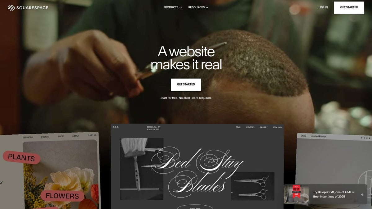
Squarespace
Squarespace’s SaaS site maintains an elegant, approachable design ideal for non-technical users. The site uses interactive demos and customer showcases to highlight versatility.
Pricing: Plans from $16/month
Core Features: Website builder, templates, blogging, e-commerce
Key Benefits: Elegant typography, interactive demos, customer showcases
Target Audience: Creatives, small businesses, bloggers
Pros: Simple visuals, straightforward messaging, versatile landing pages
Cons: Limited customization compared to competitors
Unique Selling Point: A sophisticated SaaS site that’s easy for anyone to navigate.
Squarespace’s SaaS site demonstrates the power of simplicity and clarity in modern web design.
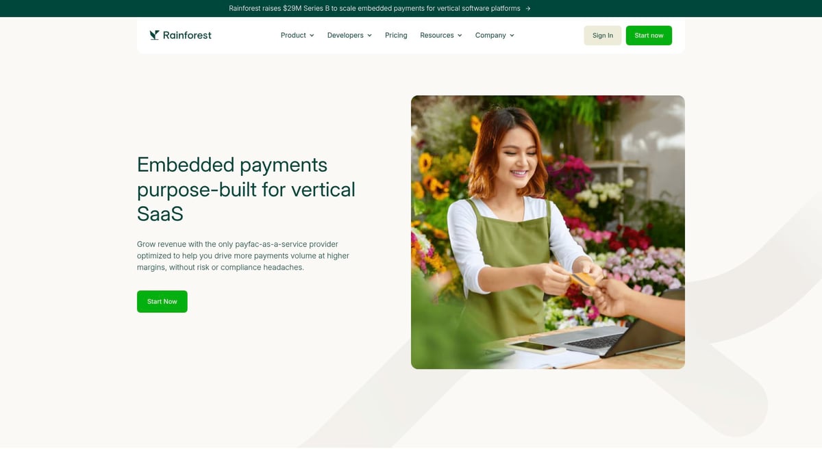
Rainforest Pay
Rainforest Pay’s SaaS site stands out with lifestyle imagery, unique UX, and thoughtful design details. The navigation is clear, and strategic animations guide visitors through the product story.
Pricing: Custom (contact sales)
Core Features: Payment processing, API integrations, security
Key Benefits: Engaging visuals, unique UX, strong design details
Target Audience: SaaS businesses needing embedded payments
Pros: Clear navigation, engaging visuals, strategic animations
Cons: Pricing transparency could be improved
Unique Selling Point: A visually differentiated SaaS site that refreshes the payment space.
Rainforest Pay’s SaaS site is proof that creative visuals can powerfully differentiate a brand.
PandaDoc
PandaDoc’s SaaS site is designed for conversion, with a demo page that guides users step by step. Clear product animations and strategic social proof build trust for new visitors.
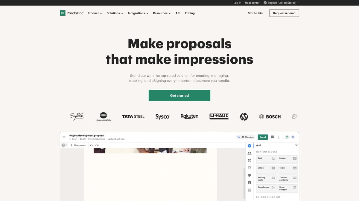
Pricing: Free eSign, paid plans from $19/user/month
Core Features: Document automation, e-signatures, templates
Key Benefits: Clear product animations, conversion-focused demo page, strategic social proof
Target Audience: Sales, HR, legal, SMBs
Pros: Step-by-step demo process, benefit-driven copy
Cons: Some advanced features only in higher tiers
Unique Selling Point: Demo page optimized for SaaS site conversions.
The PandaDoc SaaS site integrates social proof and benefit-first messaging for maximum impact.
Partful
Partful’s SaaS site is a feast for the eyes, blending video, animation, and bold colors in its creative hero section. The design showcases interactive 3D catalogs with clarity and flair.
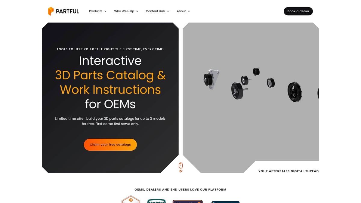
Pricing: Custom (contact for quote)
Core Features: Interactive 3D parts catalogs, aftersales solutions
Key Benefits: Creative hero design, vibrant color palette, animated product showcases
Target Audience: Manufacturers, distributors, aftermarket teams
Pros: Blended media, high-quality visuals, clear messaging
Cons: Niche focus
Unique Selling Point: A SaaS site that unifies creativity and clear value.
Partful’s SaaS site sets a new standard for visual storytelling in technical industries.
Proof
Proof’s SaaS site puts credibility front and center, using testimonials, customer logos, and real results to build trust instantly. The focus is on conversion from the very first fold.
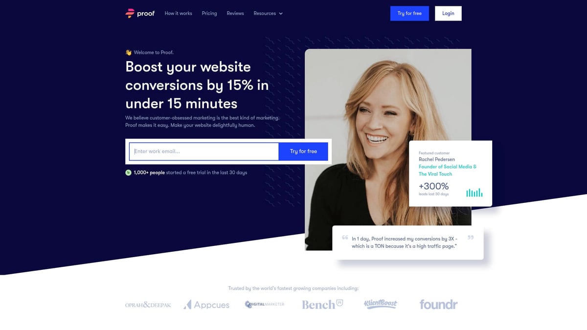
Pricing: Plans from $29/month
Core Features: Social proof notifications, analytics, personalization
Key Benefits: Immediate trust-building via testimonials and logos
Target Audience: Marketers, SaaS founders, e-commerce
Pros: Strong conversion focus, real customer stories
Cons: May not suit all business models
Unique Selling Point: Homepage designed for instant credibility on any SaaS site.
Proof’s SaaS site demonstrates how social proof can boost engagement and conversions.
KeyNest
KeyNest’s SaaS site is optimized for clarity and trust, featuring concise copy and a “Watch how it works” video. Trust signals, such as the Airbnb partnership, are prominent throughout the journey.
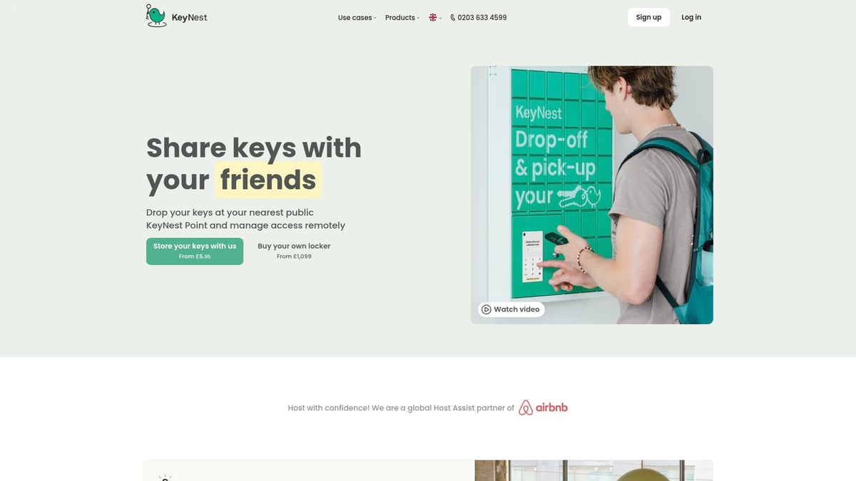
Pricing: Transparent pricing for services, see site for details
Core Features: Key exchange solutions, location search, live chat support
Key Benefits: Clear hero messaging, video walkthrough, strong trust signals
Target Audience: Airbnb hosts, estate agents, serviced apartment operators
Pros: Easy navigation, concise copy, multi-ICP support
Cons: Limited to key exchange niche
Unique Selling Point: User journey tailored for conversion on a SaaS site.
KeyNest’s SaaS site is a model for niche SaaS brands seeking to maximize user trust.
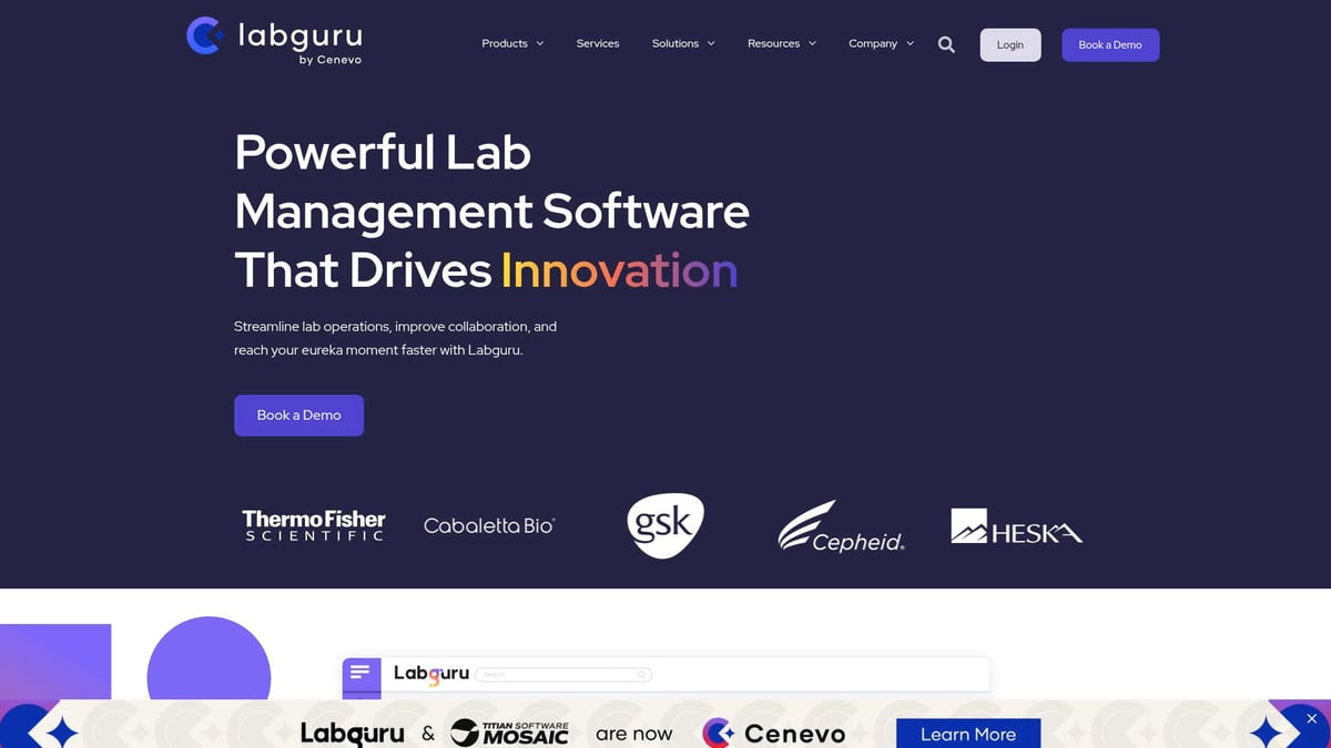
Labguru
Labguru’s SaaS site uses animated logos, custom illustrations, and product videos to engage visitors from scientific and research backgrounds. The messaging is evidence-driven, appealing to its target market.
Pricing: Custom (contact sales)
Core Features: Lab management, data tracking, automation
Key Benefits: Animated logo, bespoke illustrations, engaging product videos
Target Audience: Life sciences, research labs, biotech
Pros: Vibrant design, strong social proof, evidence-driven messaging
Cons: Industry-specific
Unique Selling Point: Creative visuals tailored to scientific credibility on a SaaS site.
Labguru’s SaaS site proves that even technical products can benefit from bold, creative design.
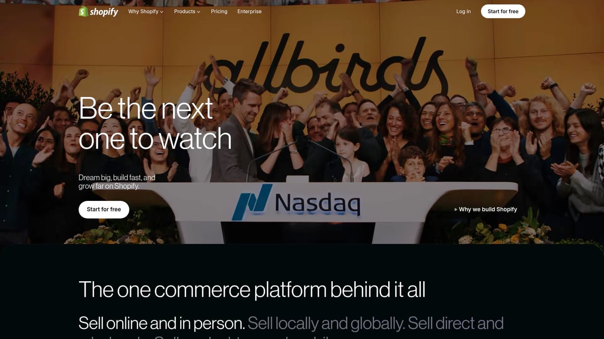
Shopify
Shopify’s SaaS site uses story-driven hero sections and step-by-step feature displays to appeal to a broad audience. The design is comprehensive, with credibility signals and feature showcases throughout.
Pricing: Free trial, paid plans from $39/month
Core Features: E-commerce platform, payment solutions, app ecosystem
Key Benefits: Story-driven hero, diverse visuals, detailed feature displays
Target Audience: Entrepreneurs, SMBs, large brands
Pros: Strong credibility, comprehensive feature showcases
Cons: Can be complex for beginners
Unique Selling Point: Storytelling approach that appeals across the SaaS site spectrum.
Shopify’s SaaS site is a benchmark for brands aiming to balance depth and accessibility.
For more on how these trends are shaping the future of SaaS site design, check out Top SaaS Website Design Trends, which explores emerging strategies and real-world examples.
SaaS Site Design Trends to Watch in 2025
As the competition for user attention intensifies, keeping your saas site on the cutting edge is essential. In 2025, several design trends are emerging that shape how SaaS brands engage, convert, and retain users. Let’s explore the four most influential trends that are transforming the digital landscape for SaaS.
Micro-Interactions and Motion Design
Modern saas site experiences are defined by subtle yet impactful micro-interactions. These are small animations or feedback cues that guide users, making the interface feel alive and responsive. Think of animated call-to-action buttons, hover effects, or smooth scrolling transitions.
Brands like Webflow and Framer lead the industry with motion design that not only delights but also clarifies navigation and next steps. According to Micro-Interactions and Motion UI in SaaS, well-executed micro-interactions can increase user engagement and reduce bounce rates. By integrating purposeful motion, your saas site can become both more intuitive and memorable.
Personalization and Dynamic Content
Personalization is no longer a luxury, but a necessity for any high-converting saas site. Leveraging user data, SaaS brands now tailor landing pages, feature recommendations, and even pricing displays to individual visitors.
Proof’s personalized notifications and Shopify’s dynamic content are excellent examples of this trend in action. Studies show personalized experiences drive higher conversion rates, as users feel understood and valued. For more insights, AI-Driven Personalization in SaaS Interfaces explores how AI is powering these tailored experiences on modern saas sites.
Minimalism and Accessibility
A minimalist approach is favored by many leading saas site designers in 2025. Clean layouts, generous white space, and high-contrast color palettes not only look modern but also enhance usability for all users.
Platforms like Asana and Craft demonstrate how stripped-back designs put the focus on content and actions, reducing cognitive load. Accessibility is also a priority, with saas site creators ensuring compliance with WCAG standards for color contrast and keyboard navigation. This makes the user journey seamless on both desktop and mobile devices.
Integrated Social Proof and Community Elements
Trust is a key driver of conversion, and saas site designs now emphasize social proof more than ever. Customer testimonials, case studies, and live user stats are strategically placed to build credibility.
PandaDoc’s demo page and Modash’s case studies illustrate how weaving community stories into the site design can reassure prospects. By making social proof visible and interactive, a saas site can foster a sense of belonging and reliability, helping visitors move confidently through the funnel.
How to Apply These Insights to Your Own SaaS Website
Translating inspiration into action is essential for any saas site aiming to stand out in 2025. By bringing together best practices, experimentation, and cross-team collaboration, you can create a saas site that not only attracts but also converts and retains users.
Auditing Your Current Site for Modern Best Practices
Start with a structured audit of your saas site. Use a checklist to review navigation clarity, messaging hierarchy, and visual structure. Evaluate how easily users move through your site and if essential information is accessible within three clicks.
Leverage usability testing tools to identify friction points. Watch for cluttered menus, inconsistent CTAs, or poor mobile responsiveness. For deeper guidance, explore SaaS landing page design tips to benchmark your site's performance against modern standards.
Common pitfalls include ambiguous value propositions, slow-loading visuals, and inaccessible color palettes. Regular audits help ensure your saas site meets evolving user expectations.
Prioritizing Clarity, Trust, and Conversion
Clear messaging is the backbone of any high-performing saas site. Craft headlines that state your core benefit in plain language. Support these with concise subheadings and visible CTAs.
Social proof, like testimonials and client logos, builds trust fast. Use real customer stories—KeyNest and Proof do this effectively—to demonstrate credibility. Embed case studies and partner logos near conversion points for maximum impact.
To drive conversions, keep distractions minimal and highlight the next step. Refine your CTAs to be direct, action-oriented, and easy to find. Every element on your saas site should support user confidence and decision-making.
Leveraging Visual Storytelling and Interactive Demos
Bring your saas site to life with purposeful visuals. Use animations, product videos, or interactive elements to guide users through features. Platforms like Webflow and Partful show how creative visuals can turn complex ideas into simple, compelling stories.
Balance is key—too many fancy effects can distract or slow the experience. Focus visual storytelling on demonstrating product value quickly. Ensure all media is lightweight for fast loading and fully accessible.
Consider using before-and-after images, short explainer videos, or clickable product tours. These techniques help users experience the benefits of your saas site firsthand, increasing engagement.
Experimentation and Continuous Improvement
Continuous optimization sets leading saas sites apart. Run A/B tests on headlines, CTAs, and layouts to learn what resonates most. Use analytics and feedback forms to gather user insights.
Iterate based on real data, not assumptions. Shopify and Apollo.io excel at ongoing testing, refining their sites for better sign-ups and demos. For more, review Landing page validation strategies to structure experiments that drive measurable improvements.
Document wins and failures, and share lessons with your team. A culture of experimentation ensures your saas site evolves alongside user needs.
Collaborating with Designers and Stakeholders
A standout saas site is rarely built in isolation. Foster collaboration between product, design, and marketing from day one. Align on brand vision, user personas, and conversion goals to keep everyone on track.
Schedule regular reviews to ensure all voices are heard. Use collaborative tools for feedback and iteration. Case studies from competitor redesigns reveal that shared ownership leads to more cohesive and effective saas sites.
Open communication, clear objectives, and mutual respect are the foundation of successful redesigns. Make collaboration a habit, not a one-time event.