
The competition in SaaS is more intense than ever, with design trends for 2026 evolving at lightning speed. A standout saas landing page is now crucial for capturing attention and converting visitors into loyal users.
In this article, we present twelve of the most inspiring SaaS landing page designs to ignite your next project—from nimble niche tools to globally recognised platforms. Each example showcases unique features, real-world strategies, and actionable insights. We also cover five proven landing page strategies so you can match the right approach to your audience and stage of growth.
Discover how modern design can elevate your brand, boost conversions, and engage users. Ready to transform your approach? Explore these cutting-edge best practices and set your saas landing page apart.
What Makes a SaaS Landing Page Stand Out in 2026?
Staying ahead in the SaaS landscape means understanding how the saas landing page has evolved. In 2026, design is more than aesthetic—it is a strategic tool for conversion. Minimalism now dominates, with clean layouts and negative space giving users room to focus. Interactivity is woven into every scroll, while AI-driven personalization tailors content for each visitor. Brands like Mobbin and Sequence set the pace, making each saas landing page feel unique and relevant.
The Evolution of SaaS Landing Page Design
In recent years, the saas landing page has shifted from dense, information-heavy layouts to streamlined experiences. Minimalist design trends prioritize clarity, using whitespace, bold typography, and strategic color to guide attention. Interactive components, like animated demos and dynamic testimonials, keep users engaged. AI-powered personalization is now standard, with real-time content adjustments based on user data.
Personalization goes beyond first names. It includes dynamic product recommendations, adaptive imagery, and even localized offers. Brands that master these elements see higher engagement and conversion rates.
Essential Elements for High-Impact SaaS Landing Pages
Every high-performing saas landing page shares core components:
- Headline and Subheadline: Instantly communicate the value proposition.
- Graphics and Product Visuals: Use real screenshots, not mockups, for authenticity.
- Primary CTA: Bold and above-the-fold, guiding users to the next step.
- Trust Elements: Client logos, testimonials, and user stats for credibility.
A compelling saas landing page is not cluttered. Instead, it focuses attention on the core offer. Competitors like Tabs and Userpilot use concise copy and clear CTAs to drive action, reducing friction for visitors.
Visual Hierarchy and Above-the-Fold Strategy
Visual hierarchy is essential for any saas landing page. Above-the-fold content must capture attention, delivering the main message before users scroll. Effective layouts use large headlines, supportive subheads, and striking visuals. Key CTAs are placed prominently, eliminating guesswork for users.
Designers favor grid systems and bold contrast to highlight what matters most. Mobbin’s gallery demonstrates how whitespace and color can guide the eye, while Vooma’s bento grid layout keeps information organized and digestible.
Speed, Video, and Social Proof: The Science Behind Conversion
Loading speed is a critical factor for any saas landing page. According to Portent, pages that load in one second convert three times more than those taking five seconds. Optimizing images, minimizing scripts, and using reliable hosting are non-negotiable.
Video is another powerhouse. HubSpot found that 38.6% of marketers rank video as the top conversion driver after speed. Explainer videos, interactive product tours, and customer testimonials in video format build trust quickly.
Social proof remains fundamental. Displaying client logos, testimonial quotes, and live customer counts reassures visitors they are in good company.
Navigation, Personalization, and 2026 Design Trends
Reducing distractions is a proven tactic. HubSpot’s A/B test revealed that removing the navigation bar can increase conversion rates by up to 28%. Simpler navigation keeps users focused on the offer.
Looking ahead, AI-driven personalization, dynamic content, and accessibility will define the next wave of saas landing page innovation. Brands are experimenting with chatbots, micro-interactions, and dark mode for modern appeal. For a deeper dive into what is shaping the future, explore these landing page design trends for 2026 with real-world examples.
In summary, an effective saas landing page in 2026 is minimal, interactive, fast, and deeply personalized. These trends and tactics are setting new standards for engagement and conversion.
12 Inspiring SaaS Landing Page Designs to Try in 2026
In an era where first impressions can make or break a SaaS business, the right saas landing page design is crucial. The following showcase features twelve of the most innovative, conversion-focused SaaS landing pages you should explore in 2026. Discover what sets them apart, how they boost engagement, and which elements you can adapt for your own saas landing page.
Mobbin
Mobbin stands out as a powerhouse resource for saas landing page inspiration. Its freemium model offers access to a vast gallery of real SaaS UI/UX screenshots, meticulously categorized by style and industry. Designers and marketers flock to Mobbin to analyze current trends and gather actionable ideas for their own saas landing page projects.

Key Features & Benefits:
- Extensive, curated library of SaaS landing page examples
- Robust search and filtering for quick research
- Regular updates keeping content fresh and relevant
Mobbin’s unique selling point lies in real, high-resolution screenshots rather than generic mockups. Community-driven curation ensures only the most effective and innovative designs are featured. The visual hierarchy on display in many Mobbin examples highlights how whitespace, bold headlines, and engaging CTAs can dramatically improve a saas landing page’s performance.
Ideal For:
- UX/UI designers seeking inspiration
- SaaS founders preparing presentations
- Product managers conducting trend analysis
Pros: Easy-to-navigate interface; up-to-date with the latest saas landing page trends.
Cons: Advanced features require a paid plan; sheer volume may overwhelm beginners.
Mobbin is invaluable for anyone aiming to create a visually compelling and high-converting saas landing page. Its categorized approach simplifies the research process, making it easier to spot patterns like effective hero sections or strategic CTA placement.
Tabs
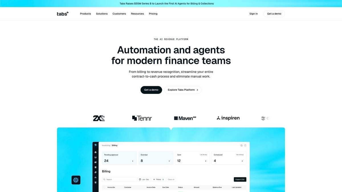
Tabs delivers a stellar example of a saas landing page optimized for clarity and conversion. With a subscription-based model, Tabs targets SaaS startups and finance teams needing straightforward financial management.
converting saas landing page. Its categorized approach simplifies the research process, making it easier to spot patterns like effective hero sections or strategic CTA placement.
Tabs
Tabs delivers a stellar example of a saas landing page optimized for clarity and conversion. With a subscription-based model, Tabs targets SaaS startups and finance teams needing straightforward financial management.
Core Features:
- Intuitive onboarding
- Real-time analytics
- Distraction-free, mobile-first design
Tabs’ saas landing page is a masterclass in minimalism. It strips away unnecessary navigation, focusing visitor attention on bold CTAs and interactive product demos. The clean layout and concise, benefit-driven headlines immediately communicate value.
Key Benefits:
- Lightning-fast load times
- Strong visual branding
- Customer logos for instant social proof
Unique Selling Points: Minimal navigation reduces distractions; mobile-first approach ensures usability for all devices.
Ideal Use Cases: Lead generation, demo bookings, trial signups.
Pros: High conversion rates due to focused design; clear value proposition.
Cons: Limited customization for non-financial SaaS sectors.
Tabs demonstrates how a saas landing page can leverage simplicity to boost engagement. By minimizing distractions and maximizing clarity, it provides a blueprint for other SaaS brands aiming to guide visitors toward action.
Sequence
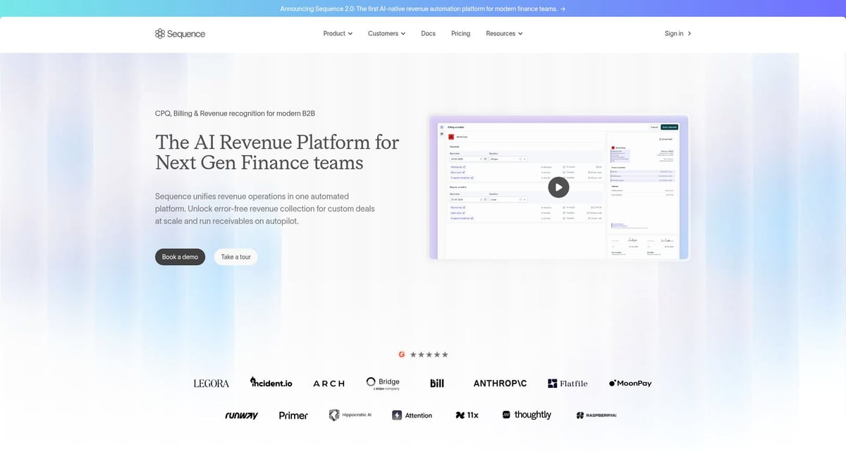
Sequence’s saas landing page is tailored for sophisticated teams needing workflow automation and collaboration. With custom pricing that scales by team size, Sequence appeals to product teams, SaaS operations managers, and enterprise clients.
Core Features:
- Workflow automation
- Collaborative tools
- Deep integrations with popular SaaS products
Sequence stands out with an engaging explainer video above the fold, an interactive product tour, and contextual CTAs that adapt based on user intent. Dynamic testimonials and real-time chat support build trust and facilitate conversion.
Key Benefits:
- Seamless onboarding journey
- Personalized user experiences
- Animated visuals and micro-interactions
Unique Selling Points: Real-time chat support for instant answers; layered content sections for easy navigation.
Ideal Use Cases: Demo requests, onboarding flows, feature showcases.
Pros: Highly interactive and visually engaging; informative content structure.
Cons: Complexity may deter very small teams.
Sequence’s saas landing page exemplifies how layering content and personalizing user journeys can elevate engagement. Its use of animation and dynamic content reflects the latest 2026 trends for interactive SaaS design.
Vooma
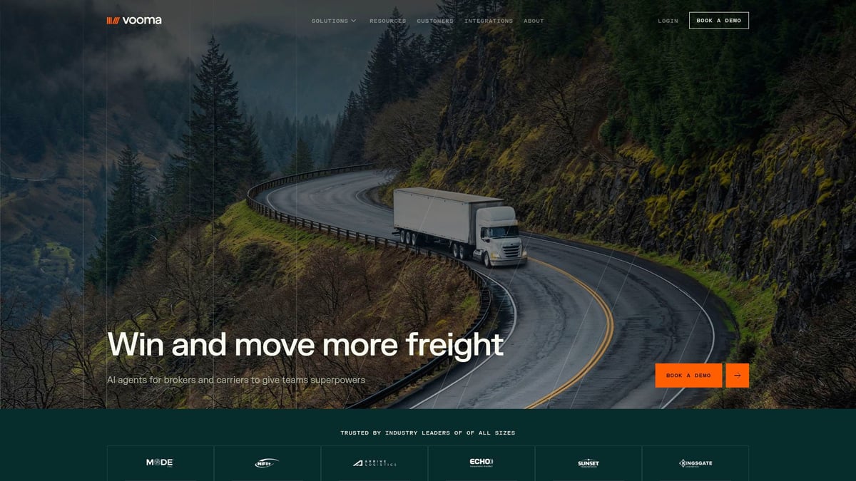
Vooma’s saas landing page is a visual standout, leveraging modern design trends like bento grid layouts and dark mode. With tiered pricing and a free trial, Vooma targets SaaS founders, growth marketers, and data analysts seeking AI-powered analytics.
Core Features:
- Customizable dashboards
- Predictive insights
- Interactive data visualizations
The saas landing page personalizes content based on user segment, ensuring each visitor sees the most relevant features and benefits. Above the fold, an explainer video quickly communicates the unique value proposition, while bold CTAs encourage immediate action.
Key Benefits:
- High engagement through interactive visuals
- Strong brand personality
- Smooth scroll animations for a seamless experience
Unique Selling Points: Personalization at every touchpoint; dark mode for modern appeal.
Ideal Use Cases: Trial conversion, product education, lead capture.
Pros: Visually unique and memorable design; high user engagement.
Cons: Advanced features may require onboarding.
Vooma’s approach to the saas landing page demonstrates how personalization and video can drive conversions, making it a must-see for brands aiming to modernize their online presence.
Tensorstax
Tensorstax offers a saas landing page designed for technical credibility and enterprise appeal. With contact-based pricing, it serves CTOs, SaaS engineers, and IT decision-makers seeking AI infrastructure management.
Core Features:
- Secure deployment tools
- Scalability support
- AI infrastructure management
The saas landing page features a futuristic visual style, including gradients, 3D assets, and technical animations. Security badges and animated walkthroughs reinforce trust and expertise, while focused messaging ensures clarity.
Key Benefits:
- Trust-building elements like case studies
- Technical depth for enterprise buyers
- Modern visual language
Unique Selling Points: Security and compliance highlighted throughout; micro-animations guide user attention.
Ideal Use Cases: Enterprise demo bookings, technical deep-dives, lead generation for large accounts.
Pros: Strong trust signals; comprehensive technical content.
Cons: May be too technical for non-IT visitors.
Tensorstax’s saas landing page is a prime example of how advanced visuals and trust elements can persuade high-value prospects. Its use of animation and security badges sets a standard for SaaS brands targeting enterprise markets.
Library Guide
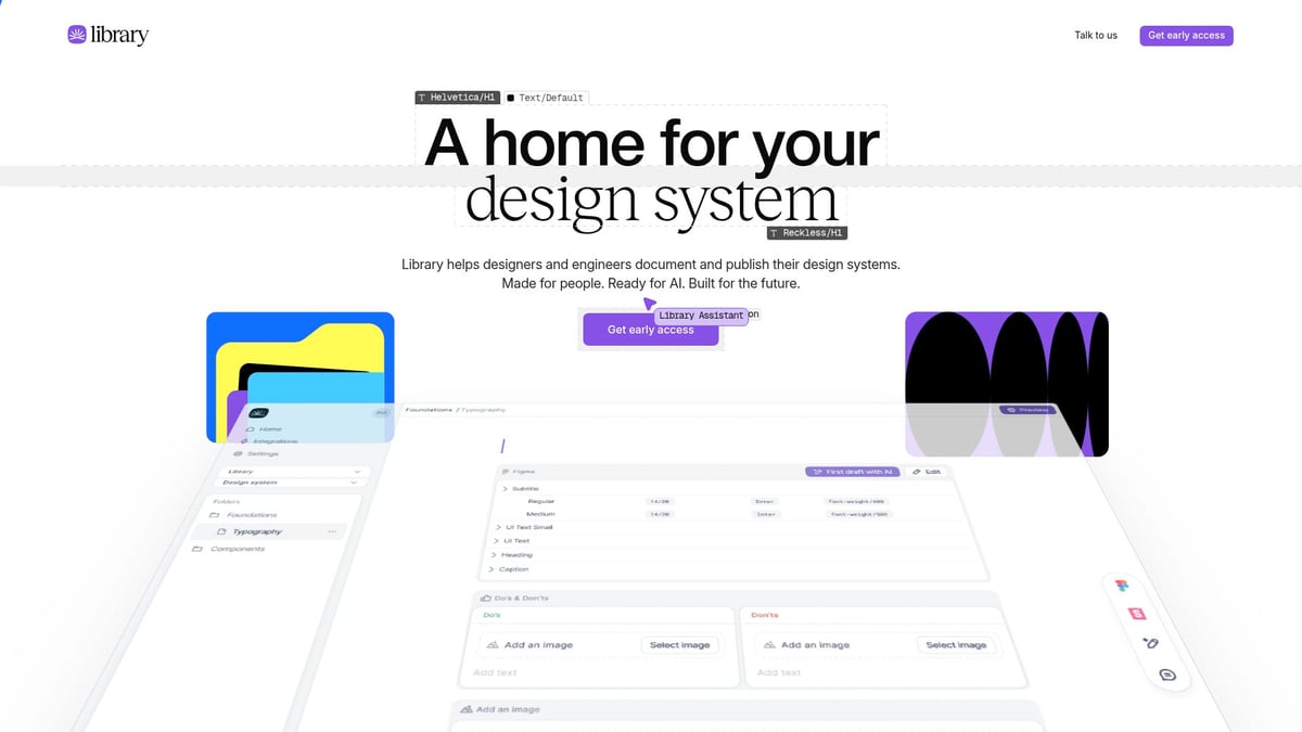
Library Guide excels as a content-focused saas landing page for SaaS buyers, product managers, and startup founders. Offering free access with premium features, it specializes in SaaS tool comparison and expert reviews.
Core Features:
- Side-by-side SaaS comparisons
- Curated resources
- Authority through expert endorsements
The saas landing page layout is clean and sticky CTAs keep conversion opportunities in view. Trust badges and concise copy reinforce credibility, while interactive filters streamline product research.
Key Benefits:
- Actionable, easy-to-navigate content
- Strong SEO structure for discoverability
- Lead magnets to capture interest
Unique Selling Points: Authority via expert endorsements; effective use of trust signals.
Ideal Use Cases: Product research, lead capture, newsletter signups.
Pros: User-friendly navigation; actionable insights.
Cons: Less visual flair compared to more design-heavy sites.
Library Guide’s saas landing page demonstrates the power of authority and simplicity, providing a model for SaaS brands that prioritize content and trust over flashy visuals.
Userpilot
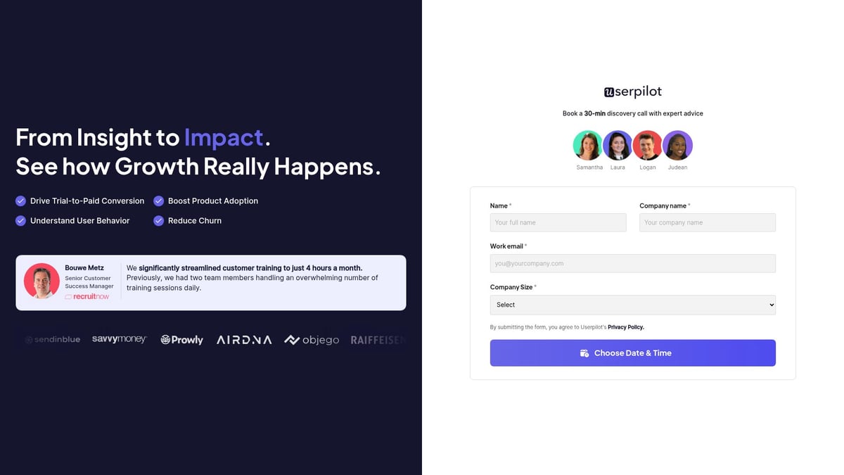
Userpilot’s saas landing page is designed for maximum conversion, especially for SaaS product teams and growth marketers. With a free trial and paid plans, Userpilot focuses on user onboarding, product tours, and in-app messaging.
Core Features:
- Interactive product demos
- A/B tested CTAs
- Real customer testimonials
This saas landing page removes the navigation bar to eliminate distractions, keeping the user’s attention on bold, benefit-driven headlines and prominent CTAs. The use of explainer videos and minimalist design helps guide visitors smoothly toward action.
Key Benefits:
- Conversion-focused layout
- Clear value communication
- Strong social proof
Unique Selling Points: Interactive demos for immediate product experience; testimonials from real users. Personalized demo scheduling adapts to company size, making every interaction feel tailored.
Ideal Use Cases: Demo requests, user onboarding, feature adoption.
Pros: High conversion rates; effective use of video and testimonials.
Cons: Minimal navigation can limit exploration.
Userpilot’s saas landing page exemplifies how clear messaging, visual focus, and social proof can drive results. For more curated examples and actionable ideas, explore best SaaS landing page examples.
Miro
Miro’s saas landing page sets a new benchmark for collaborative platforms. With its visually striking hero section, Miro immediately communicates value for teams and enterprises seeking seamless real-time collaboration.
Core Features:
- Infinite whiteboard with real-time editing
- Pre-built templates and integrations
- Advanced admin controls and enterprise security
Miro’s animated product demo draws users in, making complex collaboration features instantly approachable. The page uses vibrant accents to guide the eye, and a competitor comparison table clarifies advantages for decision-makers. Social proof is front and center—testimonials and recognisable client logos appear early in the scroll, reinforcing trust before visitors reach the CTA.
Key Benefits:
- Interactive animated demo that reduces time-to-understanding
- Pricing tiers clearly segmented from Free through Enterprise
- Competitor comparison table addresses objections in-page
Unique Selling Points: Vibrant visual identity that stays energetic without feeling noisy; demo that makes a complex product feel immediately approachable.
Ideal Use Cases: Converting teams already using sticky notes or static whiteboards; enterprise demo requests.
Pros: Exceptionally clear section separation; interactive elements sustain engagement across long scrolls.
Cons: Feature density on the page can feel overwhelming for solo users.
Miro’s saas landing page is a masterclass in translating a multi-feature platform into a coherent, conversion-focused story. The animated demo paired with prominent social proof shows how visual storytelling and credibility can work together.
Loom
Loom’s saas landing page puts video first, using engaging product demos and use-case-driven navigation to immediately communicate value. It is a textbook example of a product that markets itself by doing exactly what it sells.
Core Features:
- Video messaging and screen recording
- Analytics and viewer engagement tracking
- Cross-device compatibility and integrations
The hero section features multimedia content that showcases the product in action within seconds of page load. Community statistics and customer testimonials reinforce social proof, while a prominent CTA prompts visitors to start recording immediately—lowering the barrier to first use.
Key Benefits:
- Video-first hero demonstrates the product benefit without a word of explanation
- Use-case-driven navigation lets different visitor types self-select their path
- Bold typography and subtle animation maintain momentum through the page
Unique Selling Points: The saas landing page itself is a Loom use case—video content embedded directly on the page reflects the product’s core value proposition.
Ideal Use Cases: Converting remote teams, educators, and async communicators looking for a faster alternative to meetings.
Pros: Seamless UX; product benefits are self-evident from the first fold.
Cons: Editing features are limited on the free plan, which some visitors notice after sign-up.
Loom’s saas landing page is a great reminder that the best landing page for a product is often the one that lets the product speak for itself. If your SaaS solves a visible problem, show it happening—do not just describe it.
HubSpot Marketing
HubSpot Marketing’s saas landing page is packed with authority signals and comprehensive social proof. For SaaS brands that need to convey credibility and scale, it is one of the most instructive examples available.
Core Features:
- Marketing automation, CRM integration, and email campaigns
- Analytics, landing page builder, and lead capture tools
- Proactive chatbot and detailed FAQ
The page features consistent, high-contrast CTAs, award badges from recognized industry sources, and multi-layered video testimonials. A proactive chatbot addresses user questions in real time without requiring them to hunt through documentation. The layout is dense, but every element is intentional—HubSpot leverages its scale to show, not just tell, that the product delivers results.
Key Benefits:
- Award badges and third-party recognition immediately establish authority
- Video testimonials from identifiable customers add credibility that text cannot
- Chatbot reduces friction for visitors who have specific questions before committing
Unique Selling Points: The depth of social proof is the design element—HubSpot does not just claim authority, it documents it across every scroll.
Ideal Use Cases: Enterprise and mid-market buyers evaluating marketing automation; teams comparing multiple vendors.
Pros: Every section reinforces trust; proactive chatbot captures hesitant visitors.
Cons: Information density can slow down visitors who just want a quick price check.
HubSpot Marketing’s saas landing page proves that when your product has real traction, showcasing that evidence comprehensively is a conversion strategy in itself. Collect and display your social proof deliberately—it compounds.
Figma
Figma’s saas landing page stands out with real-time design collaboration features and a vibrant, interactive interface that doubles as a live product demonstration. It targets designers, product teams, and agencies who expect a design-forward experience from the moment they land.
Core Features:
- Real-time collaborative design and prototyping
- Robust design systems and component libraries
- Community-driven templates and plugins ecosystem
The homepage uses fun animations and well-organized navigation to guide users toward sign-up or template exploration. Bold CTAs are placed throughout with a generous free plan as the primary conversion hook. What sets Figma apart is that the landing page itself feels like something built in Figma—the product’s personality is embedded in the design of the marketing surface.
Key Benefits:
- Playful, interactive interface that lowers the perceived learning curve
- Free plan as the primary CTA removes purchase friction entirely
- Community references build a sense of belonging before sign-up
Unique Selling Points: The landing page communicates craft as much as function—visitors leave with an intuitive sense of what working in Figma feels like.
Ideal Use Cases: Converting designers currently using legacy tools; team adoption campaigns where the free tier drives bottom-up growth.
Pros: Highly interactive; strong sense of community and brand identity.
Cons: The depth of the interface can feel overwhelming for first-time design tool users.
Figma’s saas landing page is a reminder that your marketing surface should reflect your product’s quality. When what you make is design, the design of your landing page is a portfolio piece as much as a conversion tool.
Webflow
Webflow’s saas landing page is a masterclass in meta-demonstration: the site itself showcases what users can build with the product. Advanced animations, interactive content, and a clean visual hierarchy deliver an experience that immediately validates the platform’s capabilities.
Core Features:
- No-code visual website builder with CMS and e-commerce
- Advanced animation and interaction tools
- Hosting, staging environments, and team collaboration
Webflow’s landing page integrates interactive product demos and animation-rich sections that let visitors experience what is possible before they sign up. Clean navigation, strong visual hierarchy, and purposeful micro-interactions ensure no part of the page feels like filler.
Key Benefits:
- The landing page is a live proof-of-concept for the platform’s design output
- Interactive demos reduce the gap between “what does this do?” and “I can see myself using this”
- Free plan entry point paired with a clear upgrade path
Unique Selling Points: By building a spectacular landing page on Webflow and then using that page to market Webflow, the product earns credibility that no screenshot gallery could match.
Ideal Use Cases: Marketers and designers seeking alternatives to developer-dependent workflows; agencies evaluating white-label build capacity.
Pros: Stunning visual execution; interactive elements sustain attention across the full page.
Cons: Steeper learning curve than simpler no-code builders; advanced features take time to master.
Webflow’s saas landing page sets a high standard by integrating interactive content and seamless navigation. The broader lesson: whenever your product enables impressive output, build your marketing surface with that product and let it speak.
Key Elements of High-Converting SaaS Landing Pages
Creating a high-converting saas landing page in 2026 demands a careful blend of strategy, psychology, and design. Today’s top-performing pages capture attention in seconds, guide users with clarity, and make conversion feel effortless.
Here are the must-have elements for a modern saas landing page:
| Element | Description | Example Practice |
|---|---|---|
| Headline | Clear, value-focused, pain point-driven | Short.io’s homepage |
| Visuals/Media | Explainer videos, product screenshots | Userpilot’s demo |
| CTA | Bold, benefit-led, high-contrast | Senja’s glittery CTA |
| Social Proof | Logos, testimonials, user counts | Tabs’ client logos |
| Navigation | Minimal or none for focus | Userpilot’s approach |
| Speed | Loads in under 2 seconds | Tabs’ fast loading |
| Trust Signals | Security badges, awards, endorsements | Tensorstax’s badges |
A compelling headline and subheadline are the backbone of every successful saas landing page. They must address the visitor’s pain point and instantly communicate the unique value proposition. For instance, Short.io’s domain-focused headline is clear and benefit-driven, ensuring users know what they’ll gain within seconds.
Visuals and media now play a starring role. Explainer videos and product demos are proven to boost engagement and conversions. According to industry data, embedding videos can increase conversions by up to 86%—a testament to their persuasive power. Userpilot’s landing page leverages video to highlight product benefits, making complex features easy to digest.
Calls to action (CTAs) should be bold, visually distinct, and benefit-oriented. The placement and copy matter as much as the color. For example, Senja’s landing page uses a glittery effect to draw the eye, while Tabs and Vooma employ high-contrast buttons above the fold. A/B testing different CTA designs remains a best practice, as even small tweaks can significantly impact conversion rates.
Social proof is another non-negotiable for a high-performing saas landing page. Client logos, authentic testimonials, and user counts help build credibility and trust quickly. Tabs showcases well-known customer logos, and Sequence features dynamic testimonials, reassuring visitors they’re in good company.
Navigation can make or break focus. Research from HubSpot shows that removing the navigation bar can increase conversions by up to 28%. Userpilot exemplifies this by offering a distraction-free experience, guiding users directly to the desired action.
Speed is critical. Technical optimizations that ensure your saas landing page loads in under two seconds can triple conversion rates compared to slower pages. Clean code, compressed images, and a lightweight design are essential. If you want actionable strategies for all these elements, don’t miss these SaaS landing page optimization tips.
Trust signals—like security badges, awards, and third-party endorsements—are subtle but powerful. Tensorstax uses these elements to appeal to enterprise buyers, while Library Guide relies on expert endorsements to convey authority.
In summary, the anatomy of a high-converting saas landing page blends compelling copy, engaging media, strategic CTAs, and robust trust elements. By drawing inspiration from the best in the industry and applying proven best practices, you can transform your next landing page into a conversion powerhouse.
SaaS Landing Page Strategies: 5 Approaches That Drive Results
The twelve examples above show the full range of what a polished saas landing page can look like. But design is only one variable. The underlying strategy—the job you are asking the page to do—determines which design patterns are right for your situation. Here are five proven landing page approaches for SaaS, and when to reach for each one.
Validation-First Landing Page
A validation-first saas landing page is built to test demand before committing to full-scale development. The goal is to learn, not to launch—and the design reflects that. A clear value proposition, a single sign-up or waitlist form, and a brief survey asking about the visitor’s problem are the only elements that matter. Social proof is thin (because you have none yet), so the page leads with empathy and specificity about the pain point instead.
This approach is best for pre-MVP launches, idea validation, and audience building. The key metric is not conversion rate but who converts—email quality and survey responses tell you whether you have found product-market fit before writing a line of production code.
Interactive Demo-Driven Landing Page
An interactive demo-driven saas landing page removes the biggest barrier in complex B2B sales: prospects cannot evaluate a product they have never touched. Embedding product walkthroughs, one-click sandbox access, or a demo scheduling widget directly in the page allows visitors to experience value before they commit to a conversation.
This approach works especially well for sales-led teams selling to enterprise buyers with long evaluation cycles. The investment in building a demo environment pays back through shorter sales cycles, better-qualified leads, and a noticeably lower bounce rate among the visitors most likely to convert.
Minimalism-First and Conversion-Optimized
A minimalism-first saas landing page strips away everything except the single action you want the visitor to take. Bold headline, one-sentence value proposition, one CTA, one form field. This is the correct approach for early-stage products running paid campaigns, beta invite rollouts, or pre-launch signups where traffic is bought and the margin for distraction is zero.
The counter-intuitive insight: less content does not mean less conversion. When every element is present to serve the CTA and nothing else, visitors make decisions faster. The trade-off is depth—this format cannot carry complex products that require education before sign-up.
Developer-Centric Landing Page
A developer-centric saas landing page speaks the language of the person who will actually implement the product. It leads with API documentation previews, code samples, quickstart guides, and sandbox environments. Pricing is transparent and often usage-based. The tone is direct and avoids marketing language that technical buyers distrust.
This approach is non-negotiable for API-first products, developer tools, and open-source platforms. The design serves discoverability and trust rather than emotional persuasion. Developers evaluate products by trying them—every friction point between “landing on the page” and “running the first API call” is a conversion failure.
Gamified and Resource-Rich Landing Pages
A gamified saas landing page uses progress bars, achievement triggers, interactive quizzes, or reward mechanics to sustain engagement and encourage sharing. A resource-rich page delivers value upfront—design galleries, downloadable templates, inspiration libraries—turning the landing page into a destination visitors return to and recommend.
These approaches suit products for education, productivity, and community-driven audiences, where time on page and repeat visits are meaningful signals. The risk is that the interactive elements become the goal rather than a means to conversion; the design must keep the primary CTA visible and reachable throughout the experience.
Trends Shaping SaaS Landing Page Design in 2026
In 2026, the pace of innovation for every saas landing page is accelerating. New technologies, shifting user behaviors, and competitive pressures are driving a wave of design trends that are reshaping how SaaS brands connect with their audiences.
AI-Driven Personalization and Dynamic Content
Personalization is no longer optional for a high-performing saas landing page. AI now powers real-time adjustments to headlines, images, and CTAs based on user data and behavior. Platforms like Sequence are leading with dynamic onboarding flows and contextual recommendations that adapt as users interact. Userpilot’s demo scheduling changes based on company size—making the experience feel bespoke from first contact.
Dynamic content ensures each visitor gets a tailored experience, boosting engagement and conversion rates. By leveraging AI, SaaS brands transform static pages into interactive journeys. Studies show personalized user journeys can lift conversions by up to 30 percent—making this the highest-leverage trend of the year.
Accessibility, Inclusivity, and Micro-Interactions
Accessibility is a core requirement for every modern saas landing page. Designers are prioritizing color contrast, keyboard navigation, and screen reader compatibility, ensuring everyone can engage with SaaS products. Mobbin showcases many landing pages that excel in accessible design and inclusive UX. With mobile traffic now accounting for over 82% of landing page visits, responsive design is a prerequisite, not a differentiator.
Micro-interactions and subtle animations—hover effects, progress indicators, animated CTAs—guide users seamlessly through the page. These touches enhance engagement without overwhelming the user and are increasingly standard across leading SaaS brands.
Visual Trends: Dark Mode, 3D, and Bento Layouts
Dark mode is now standard for many saas landing page designs, offering users a choice that reduces eye strain and signals modernity. Bento layouts, with modular card-based sections, create clear content separation and visual interest—Vooma’s use of a modern bento grid exemplifies this at its best. Three-dimensional interactive elements, pioneered by tools like Spline, let visitors interact with the product in the browser before signing up, collapsing the gap between marketing surface and product experience.
These visual treatments differentiate brands in a market where minimalist white pages have become the baseline. When everyone is minimal, controlled richness becomes the differentiator.
Data-Driven Design, Real-Time Support, and No-Code Iteration
SaaS teams are using analytics—heatmaps, A/B tests, session recordings—to refine every aspect of the saas landing page, from CTA placement to headline testing. A recent study on SaaS landing page conversion rates reveals a median conversion rate of 3.8%, making ongoing optimization essential. Integrating chatbots and real-time support tools reduces friction and increases the likelihood of capturing leads from visitors who have specific objections.
No-code builders like Webflow and Framer have changed how fast teams can iterate. The time from “let us test a new hero” to “live on production” has dropped from weeks to hours. This speed advantage compounds: teams that run more experiments learn faster and compound conversion gains that slower-moving competitors cannot match.
How to Apply These Lessons to Your Own SaaS Landing Page
Transforming your saas landing page into a high-converting asset is all about applying targeted, actionable improvements. Start by looking at your current design with a critical eye, comparing it to the standout examples and trends highlighted above.
Step-by-Step Guide to Elevate Your SaaS Landing Page:
- Audit Above-the-Fold Content: Make sure your saas landing page headline is clear and your value proposition is immediately obvious. Use strong visuals, concise messaging, and engaging CTAs.
- Prioritize Speed: Optimize images, streamline code, and test loading times. Remember, a faster saas landing page can triple your conversion rates compared to slower sites.
- Leverage Social Proof: Showcase client logos, testimonials, or user counts near your main CTA for instant credibility.
- Simplify Navigation: Reduce distractions by limiting or removing navigation bars, focusing visitors on your core offer.
- Integrate Multimedia: Consider adding a short explainer video or interactive demo to increase engagement and conversions.
- Choose the Right Strategy: Match your landing page approach to your stage—validation-first for pre-launch, demo-driven for complex B2B, minimalism-first for paid campaigns.
- Validate and Iterate: Regularly test new ideas using A/B experiments. For practical resources, explore tools for SaaS landing page validation.
Common Pitfalls to Avoid:
- Cramming too many features above the fold
- Unclear or generic messaging
- Neglecting mobile responsiveness
- Failing to optimize for speed and accessibility
- Choosing a landing page strategy mismatched to your stage (e.g., a resource-rich page for a pre-launch product with no content yet)
Quick Win Checklist for Your SaaS Landing Page:
| Action | Impact | Status |
|---|---|---|
| Clear headline and subheadline | High | [ ] |
| Strong, visible CTA | High | [ ] |
| Fast loading (<2s) | High | [ ] |
| Social proof present | Medium | [ ] |
| Distraction-free layout | High | [ ] |
| Mobile optimized | High | [ ] |
| Strategy matched to stage | High | [ ] |
| A/B test running | Medium | [ ] |
Adopt a mindset of continuous improvement. Use inspiration from leading examples, experiment with new trends, and never stop testing. With these steps, your SaaS landing page can evolve into a top performer that drives measurable growth for your business.